BIOPHILIA IS A spatial augmentation ui
designed for semantic wayfinding experience
What would be the next-generation augmented reality experience look like? And how might it can be applied to wayfinding? This project suggests how the emerging technology can provide long-term values to users.

Concept Video
Mobile Prototype Demo
ABSTRACT
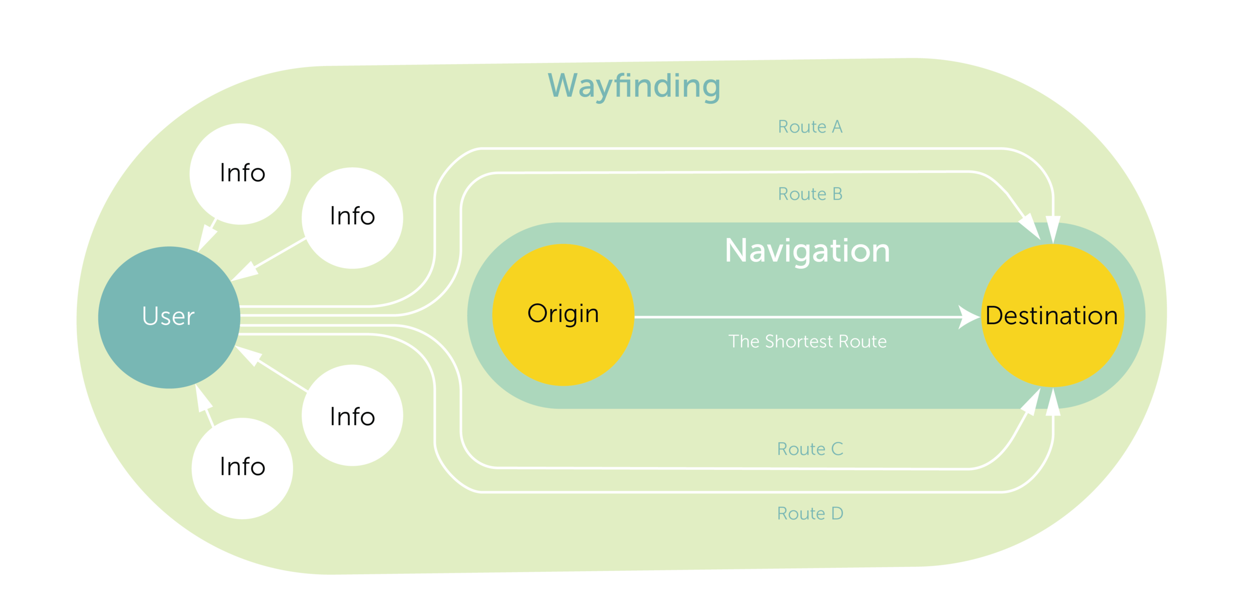
Exploring in an unfamiliar urban space causes a lot of cognitive overloads while moving between multiple different types of information about the area. Users also experience safety hazard while walking through an unsafe neighborhood or road with no sidewalk as guided by their GPS. This is because most current map solutions focus mainly on navigation, moving from one place to another at the shortest distance. Wayfinding, on the other hand, should be defined as spatial problem solving, which requires the users to get various kinds of peripheral information including safety, unexpected delay, and so on. The ideal wayfinding experience should be able to reflect travelers’ ability to achieve a specific destination by providing semantic information.
This project, targeting pedestrians exploring in urban space, envisions the near future where the real space becomes the next web browser, powered by 3D model mapping, augmented reality technology and speech recognition. BIOPHILIA illustrates how the urban explorers get semantic wayfinding information directly from the real space and buildings, supporting the ideal urban navigation experience.
SEMANTIC WAYFINDING
Branching out from Lynch’s five elements of an urban space structure - Paths, Edges, Districts, Nodes, and Landmarks - semantic information is embedded in the environment that can give a better understanding of the urban environment. Although these five elements are easy to be recognized by the user, the majority of their semantic information is abstract or unseen in the environment, causing a large amount of effort to search for.
Wayfinding is a sophisticated activity that requires the user’s ability to perceive urban space and make optimal decisions. The semantics of wayfinding indicates that user-friendly wayfinding experience should consider not only navigation information but also peripheral information to support urban exploration at full extent. BIOPHILIA is designed to expand the users' experience and confidence by providing an integrated semantic information platform so that the users can enjoy urban adventure to full extent.

RESEARCH Process
The full-extent design research was conducted to understand user’s behavior on wayfinding and learn more about their mental model. The research process consists of three steps; first, the online survey for investigating the pain points in current wayfinding experience. Second, the participatory design workshop including 1) user journey mapping, 2) semantic mapping and 3) design with metaphors. Finally, the concept speed-dating for initial prototypes.

Three important implications was found during the observation. First, a lot of users chose the visual metaphors from nature to visualize the semantic information. It is assumed that biomimicry design gives more instant and intuitive understanding to the users, therefore, using the visual metaphors from nature might reduce the cognitive load to proceed the information. Second, the participants often utilized the façade of buildings to visualize the navigational information. They used a point color to emphasize the destination or overlay the verification reference on the building surface. The fact that the participants prefer to overlay the navigation information on buildings connects to their needs to see the visual guidance at their eye level, while most AR navigation applications overlay the route on the road surface. Finally, the participants designed experience of loading one semantic information at a time. This can be interpreted that users do not want to see an excessive amount of information simultaneously.


Based on the result of synthesizing, I made initial sketches of each semantic information. The basic assumption of this concept is that users might be able to understand the meaning of the organic visuals without any text information. Also, I assumed that the moment of spatial augmentation and information process becomes shorter since the users don’t need to spend time on the interpretation of the visuals. The concept includes the multimodal interaction of gazing and asking in order to pull the semantic wayfinding information into a target space.


After finalizing the UI design plan, I built a working prototype with a set of selected semantic information visuals and designed a question-and-answer experience with voice interaction. For prototyping, IBM Watson speech interaction API is used to create the conversational interface, and Vuforia augmented reality solution is used for spatial augmentation experience. The prototype application is built to support mobile AR. Because of the technical limitation in real-time 3D rendering, I took 2D images of downtown Pittsburgh area and overlaid the UI animation with Vuforia solution. After Effects is used for the UI animation.


KEY FEATURES
01
ZERO-UI INTERACTION
The ubiquity of semantic information in the urban space indicates the possibility of using the space as a web browser powered by reality computing. The advance of augmented reality and object recognition technology enables the users to interact with the unseen information in the real space.
One another thing needs to be considered for out-of-screen experience is removing screen-based interface and context-awareness. Using multimodal interaction, the user will be able to pull the semantic wayfinding information directly from the target building. When it comes to the information regarding safety advisory or delay warning, BIOPHILIA will automatically pull the information when the user is getting closer to the target space.


02
BIOPHILIC MINIMALISM
Humans have an instinct understanding of the form of mother nature, which is why BIOPHILIA resembles it. There are three design principles to design the visuals. First, rather than presenting all details, the system focus on one or two information that is critical for users’ decision-making process. In this way, the system doesn’t burden the users’ cognitive process nor block their field of view with an excessive amount of visuals. Second, use the organic texture to give higher contrast between the augmented information and the urban space. Urban areas are filled with man-made structures, meaning that using nature-like images can be looked more salient in artificial environments. Finally, the biophilic design gives more emotional pleasure to users, particularly effective in stress relieve.


03
DESATURATING BACKGROUND ENVIRONMENT
In order to give better contrast between the virtual information and the background, desaturating background might be considered to make the users focus more on augmented information. Artificial environments like downtown urban spaces include hundreds of different colors. Therefore, reducing the number of hues may help the users distinguish the augmented information from the real space.
Desaturating background should be considered especially when 1) the surrounding environment contains multiple different hues, 2) the tone of virtual information and the background is similar, and 3) more than two different colors are applied to the virtual information.

04
ADAPTIVE SCALABILITY
The final thing to consider for the spatial augmentation experience is the scale of the UIs. The virtual information is overlaid on the entire façade, yet that wouldn’t always work well depending on where the users are standing at. If their target building is too close to them or if it’s on the same side of the users, it would be hard to observe the virtual information.
Panero and Zelnik (1979) mentioned that the normal line of the sigh is about 10 degrees below the horizontal line when standing, and the magnitude of the optimum viewing zone for display materials is about 30 degrees below the standard line of sight. To minimize the distortion of the view, the virtual information will be slid to the front view depending on the users’ perspective. It is scaled down to the height of a ground level of a building. When the users move far enough to be able to see the entire building, the system will use the entire facade.

