
- Individual Project
- Duration: 6 weeks
- Tool used: Adobe Photoshop, Illustrator, After Effects
EzNav is the augmented navigation service platform
that can be accessed across multiple kinds of devices.
Given the topic "Tabs, phones and boards", I created a set of hi-fi UI screens for different kinds of resolution. (For detail design process of EzNav, click 'Design Process Blog' on top. The purpose of this project is 1) designing UI elements for more than three kinds of devices and 2) creating a video prototype to show interactions happen on the screens.
Introduction: Inspired by a Journey to Santiago
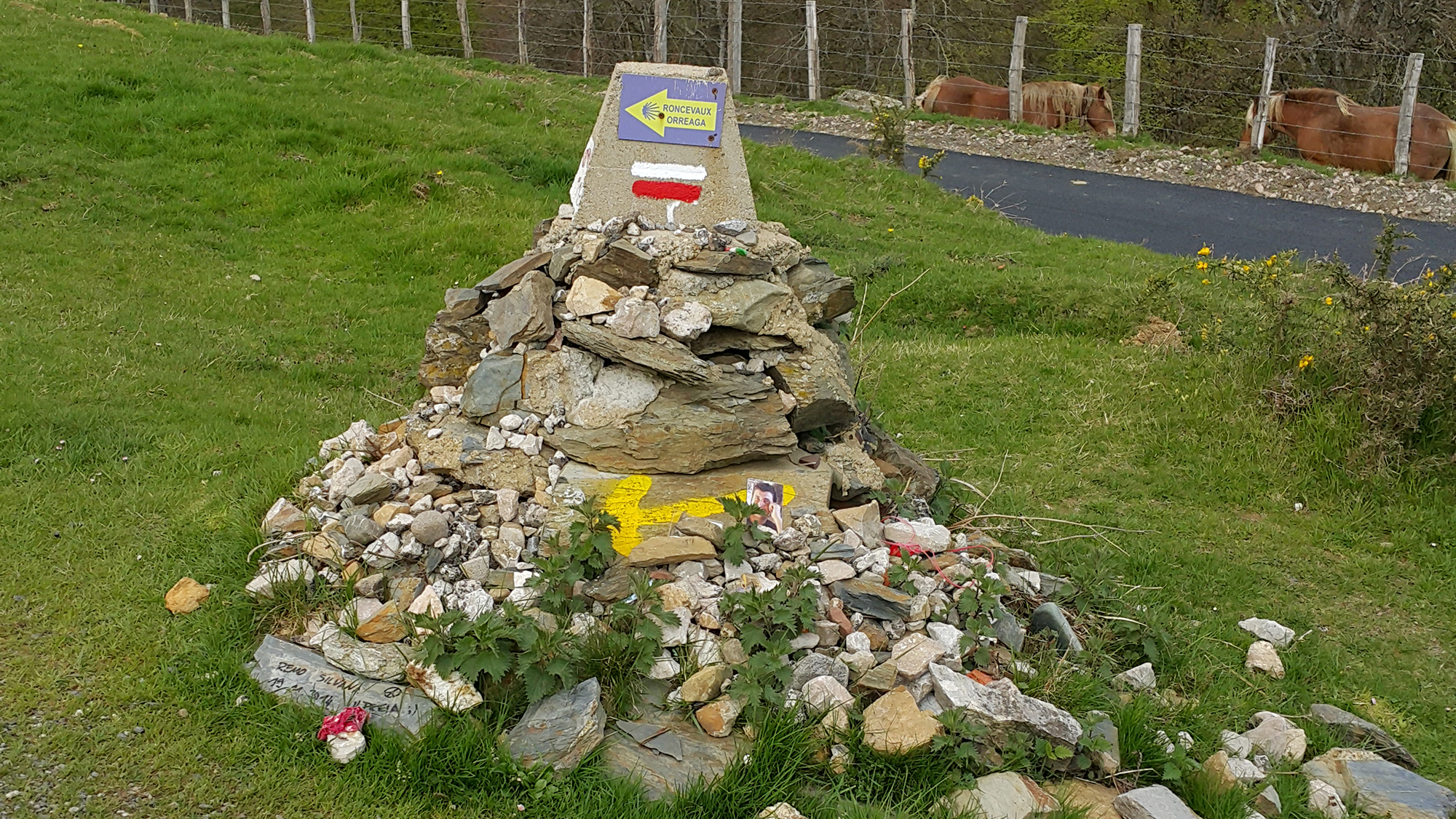
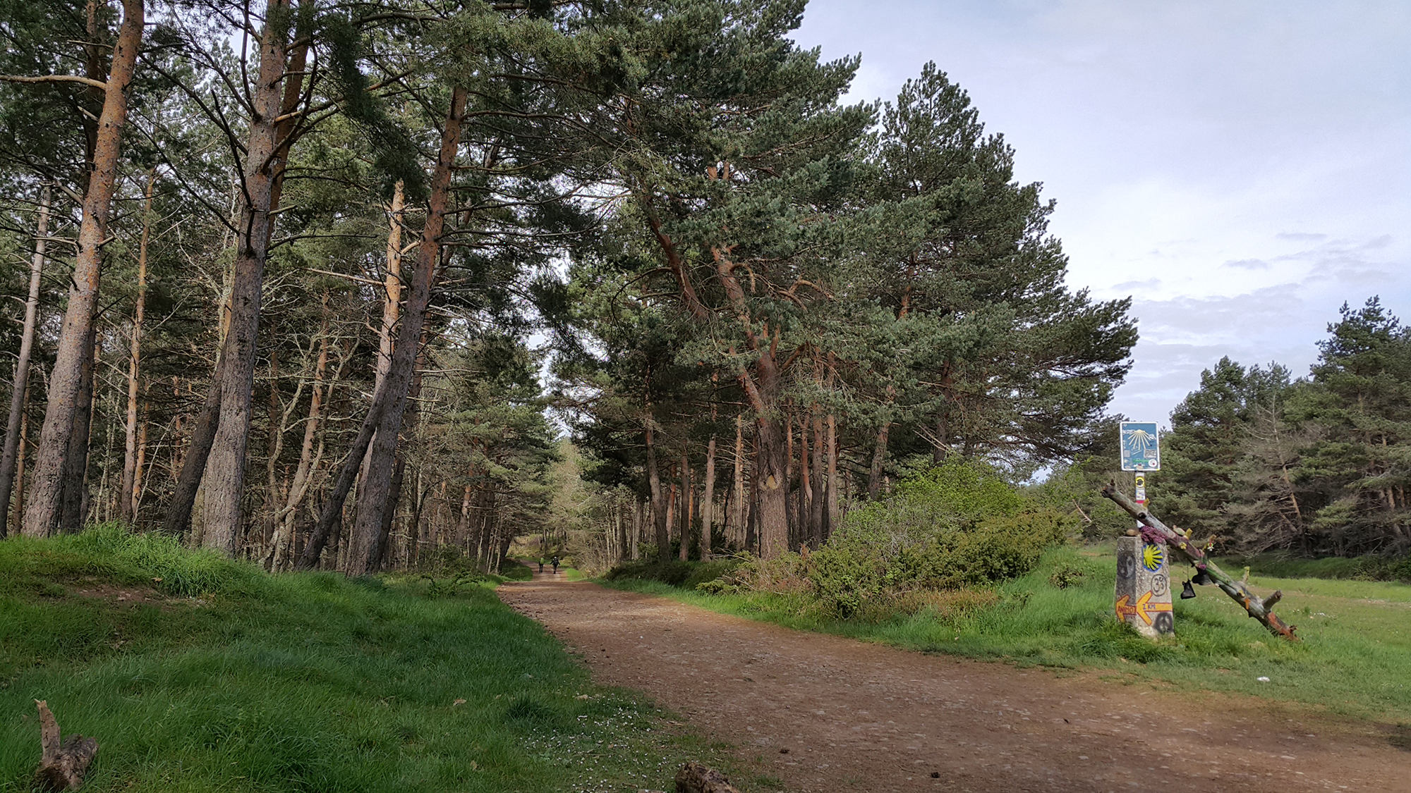
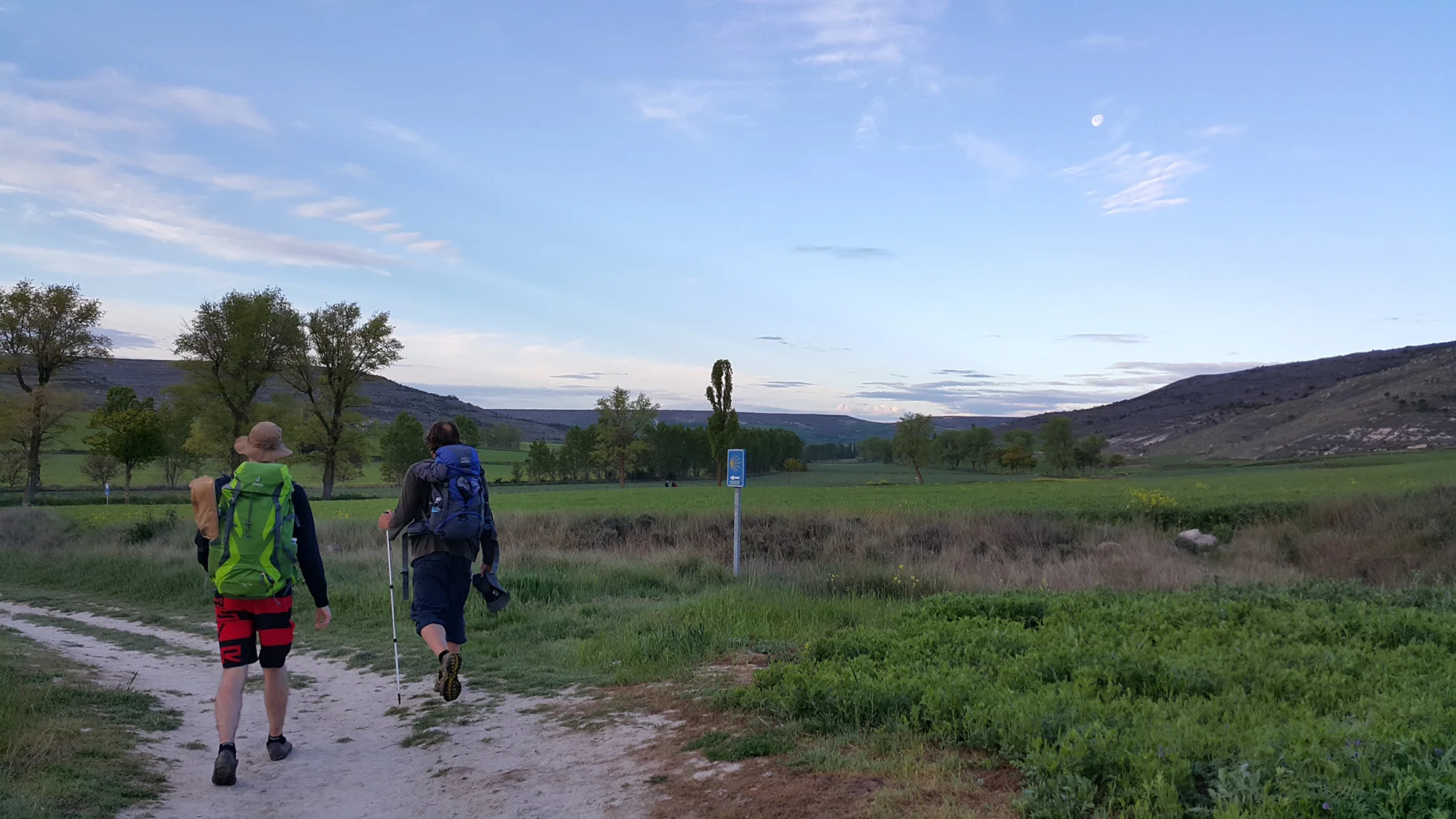
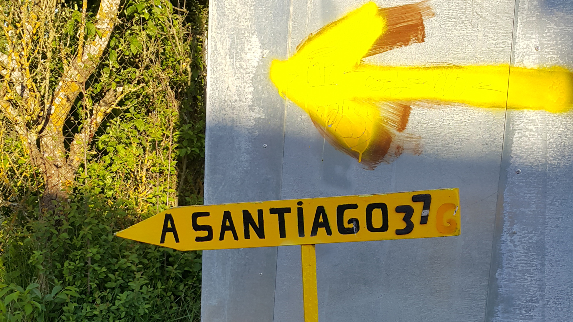
Before I started my school, I did one of the most amazing travels ever in my life: El Camino de Santiago, the ancient pilgrimage route over 770km from French-Spanish boarder to Santiago de Compostela in Galicia in northwestern Spain, where tradition has it that the remains of the saint are buried. When starting my pilgrimage, I was worried about getting lost in the middle of nowhere. It was a long journey in a foreign land and I couldn’t use cellular data outside the town. Surprisingly however, I didn’t get lost during the entire hiking; all I did was just following the yellow arrows marked on roads, walls, telephone poles and signs. When there were no arrows, then other hikers went ahead marked arrows with sticks and stones. These yellow arrows, starting from small town in France, led me the way during the entire 770km and I had no problem finding a way. It was the most pristine but so intuitive navigation system I have ever seen.
After finishing the pilgrimage in Spain, I spent one more month to visit 16 European cities in 6 countries. Contrast to my experience in Spain, I saw so many backpackers including myself often get lost when trying to find their place to stay for the first time after getting off the bus/train in the middle of the new place. I got a huge inspiration from both traveling experiences and decided to design a new navigation platform for travelers.
Exploratory Research
2 years ago, I sat down on the bus stop bench and observed 10 backpack travelers in Segovia, Spain. Segovia has many bridges and hills just like Pittsburgh. I found that all people have any kinds of maps - paper maps, Google maps, guide book maps etc. However, I saw that everybody didn’t find a right direction to their hostel and returned to the bus stop.
As soon as this project started, I interviewed 6 more people and asked them how they feel when finding a way in a strange place. All of them answered that they often get lost when getting out of the train or subway station, because they lose a sense of direction at unfamiliar places. Also, 4 people answered they tend to find the direction rather than matching the name of streets with their map. Finally, another 4 people said that they don’t use data roaming outside the country.
After that, I looked over similar kinds of services. When it comes to downloadable maps, Tripadvisor has provided them for major tourstic cities. Their map is more like local information based, and their navigation feature is less precise than Google maps. Meanwhile, I also found referencial AR based navigation concept videos. One interesting AR navigation was “Penguin NAVI”; a virtual penguin shows ahead of aquarium visitors. They can find the direction just by following the penguin. Another example was Smart UJI, which visualize almost as same as my concept of direction guide. It was a very create and intuitive idea and gave me a confidence of developing my idea.

AR navigation reference: Penguin NAVI

AR navigation reference: Smart UJI
Initial Sketch

Based on the inspiration and exploratory research, I thought about combining ideas of “direction” based interactive navigation and location information without using GPS. For smartphones and tabs, I thought about augmented visual arrows and signs seen on camera screen. These visual signs will interact with users as they move ahead and give feedback whether they are heading the right way. I also considered interactions for smart watches; unlike phones and tabs, watches don't provide a camera. Therefore, I imagined that combining visual arrows and haptic cues in order to make directions more clear.
1) Inspired by yellow arrows on the camino, the visual signals (arrows, floor lines, signs) pop up on camera screen. Visual directions are supported on smartphones and tabs. When hurdles (cars, fences, poles etc.) are recognized ahead, warning message will be popped up and stop navigating immediately.
2) For those who use smart watch, haptic interaction will be provided. Instead of following arrows/signals, vibration signals will let users know where to make turns or stop.
Confirm the Concept
Through initial sketches, I decided to focus more in visual directions and I made a concept of EzNav as a service platform that connects between travelers and local business owners. EzNav communicates with both cohorts with multiple kinds of devices; travelers may participate in updating better directions or shortcuts; local business owners may induce travelers by registering their store locations. As lot of people joining EzNav platform, it builds a precise pedestrian navigation database.

EzNav as a service platform
Create Persona & Storyboards
After confirming the concept, I worked on creating a persona and storyboards for EzNav. My persona, Jack, is 21 year old college student who loves traveling but has a problem in reading maps.

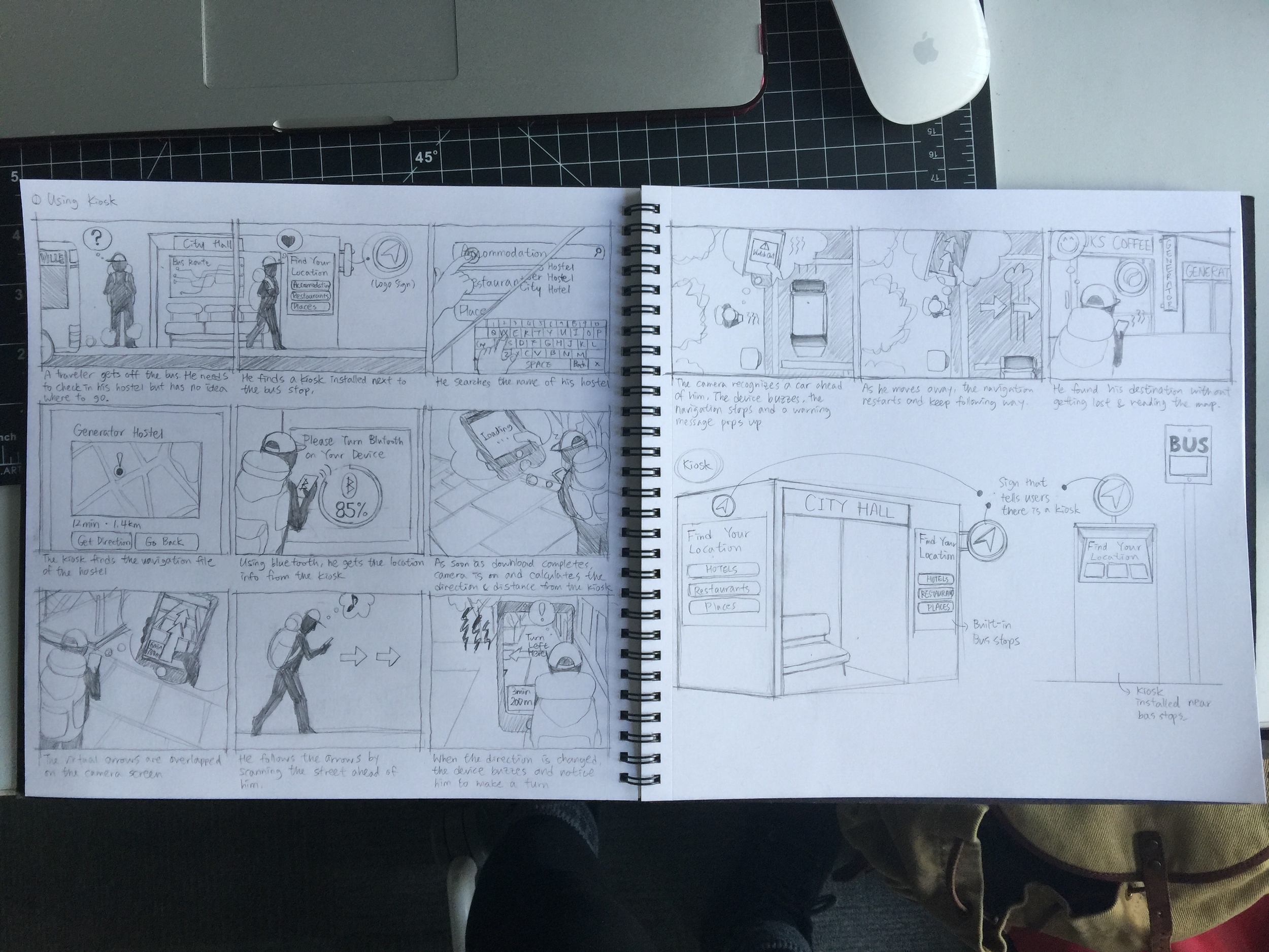
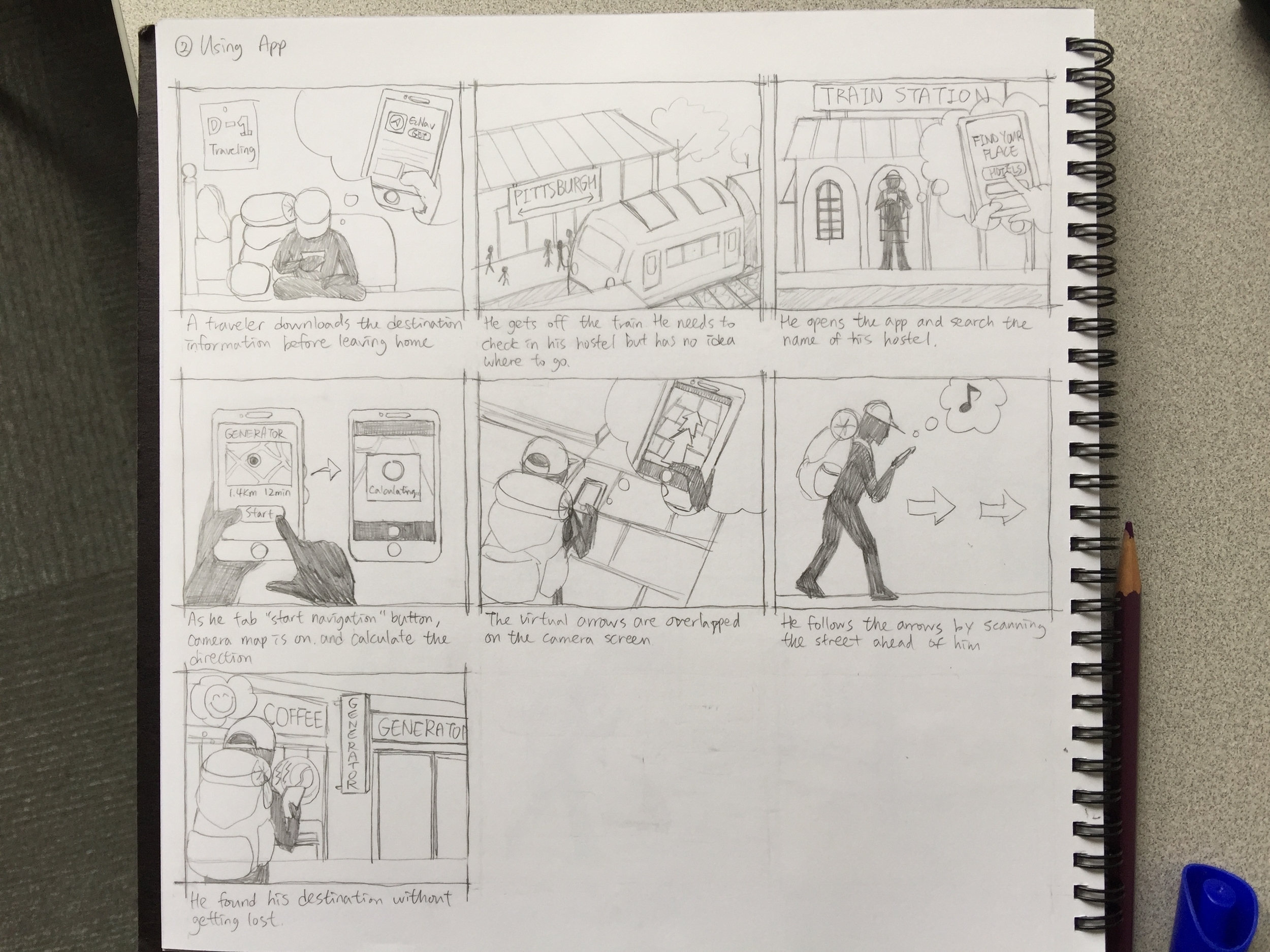
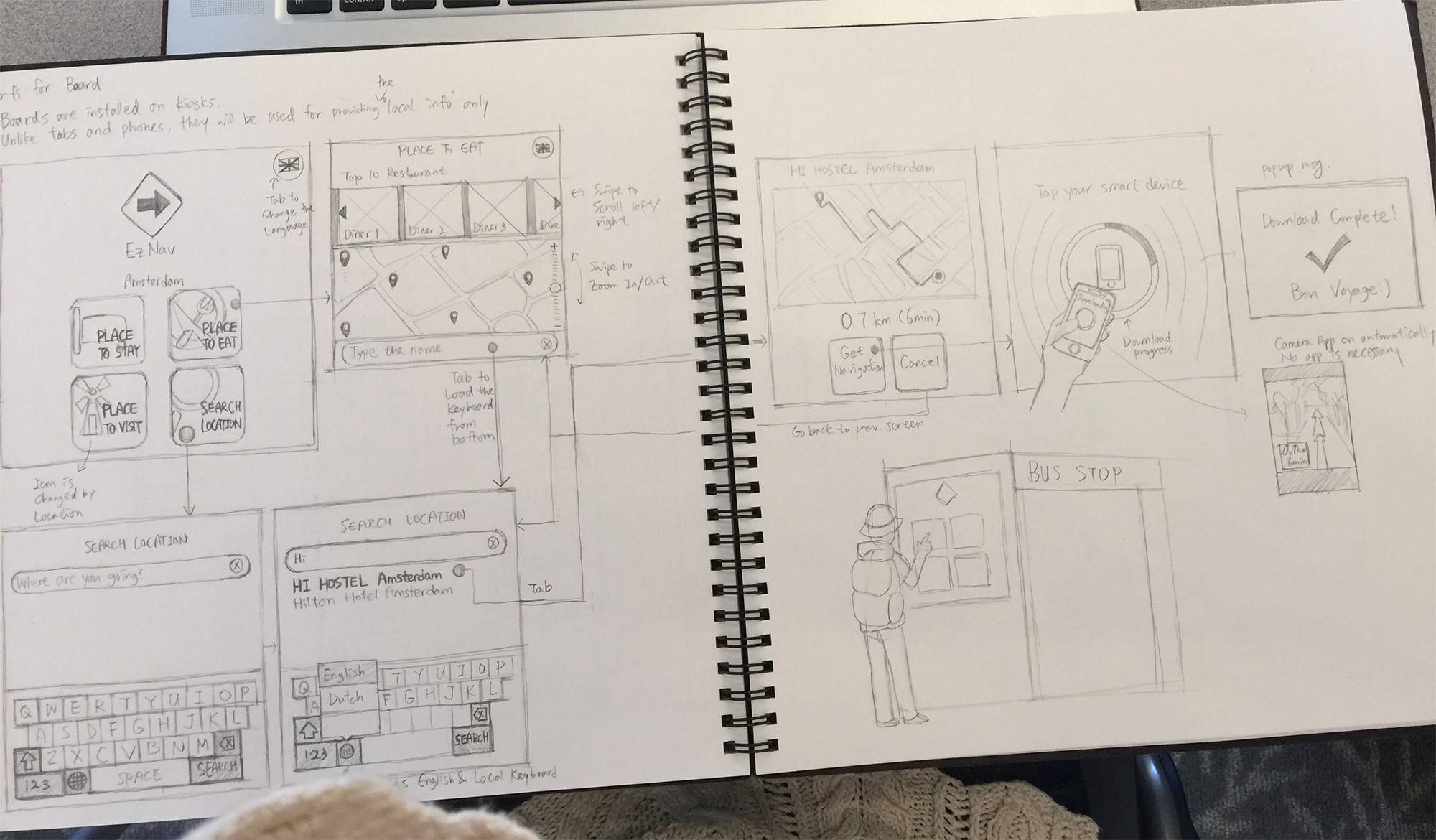
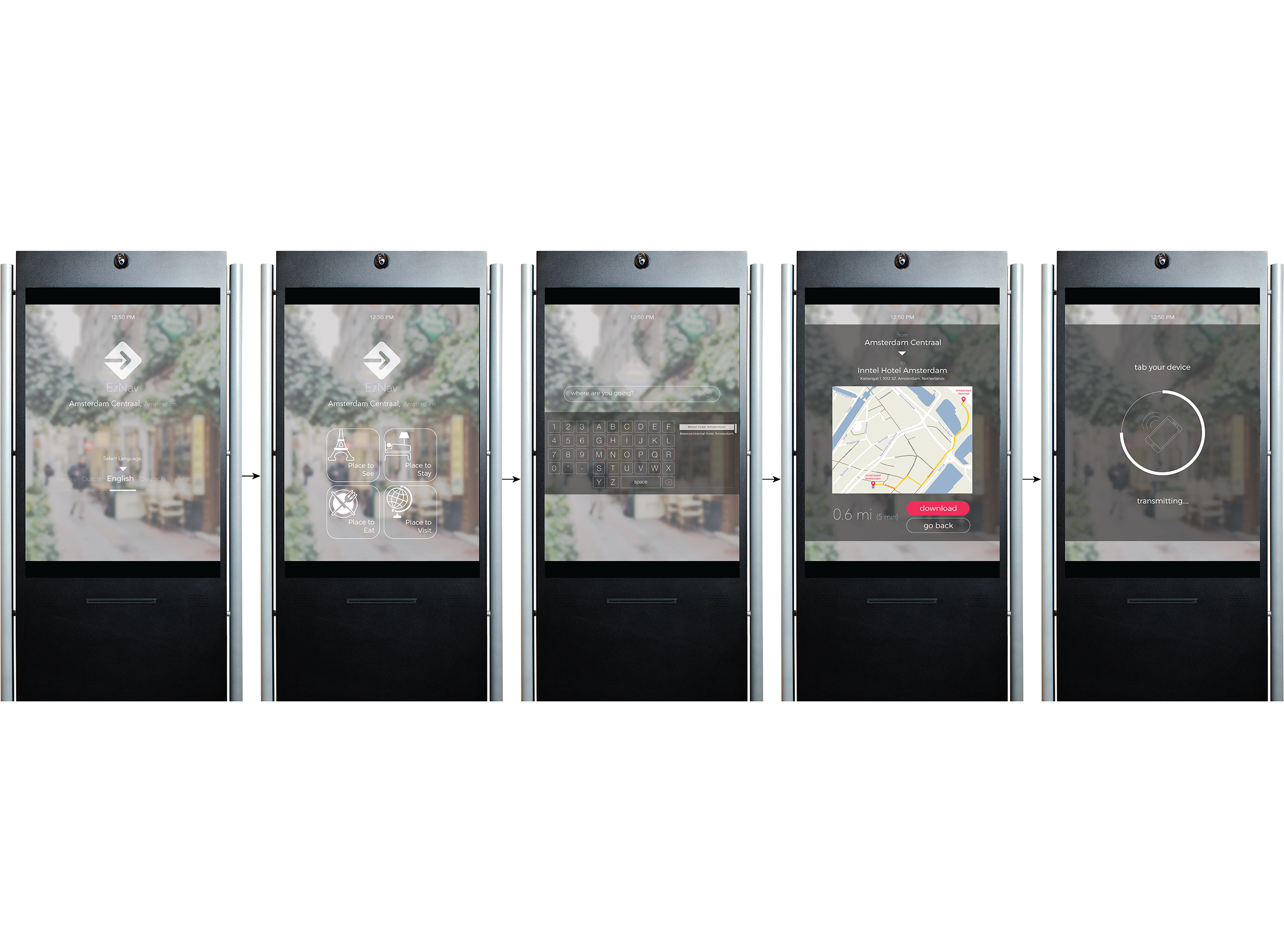
I thought of two scenarios; using an app and using a kiosk. Although both channels provide augmented reality navigation, the user experiences are different. Kiosks will support users who didn't prepare maps at home but has no wi-fi connection. They also help people who are not used to use GPS based maps; other than those situations, I imagined that people download maps before leaving home.
from Lo-Fi to Hi-Fi UI
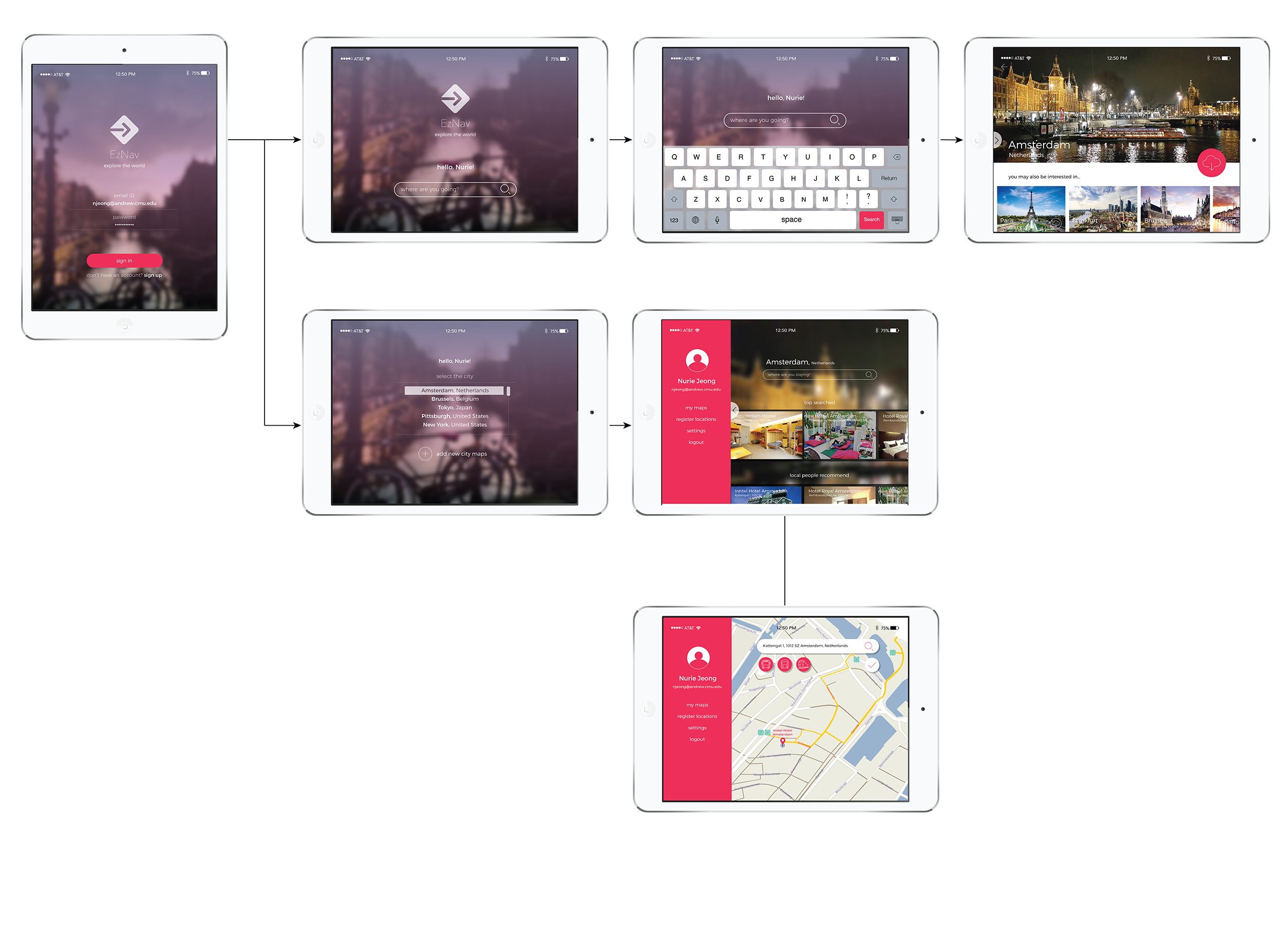
Based on the storyboards, I designed lo-fi and hi-fi landing pages for different resolutions. Whereas smartphones and tabs are considered as personal devices that provides all downloadable maps, large screens will be used for information kiosks and they will only provide local maps. Also, if users download maps from the kiosks, the camera app is on and skip the whole logging in and location search process.
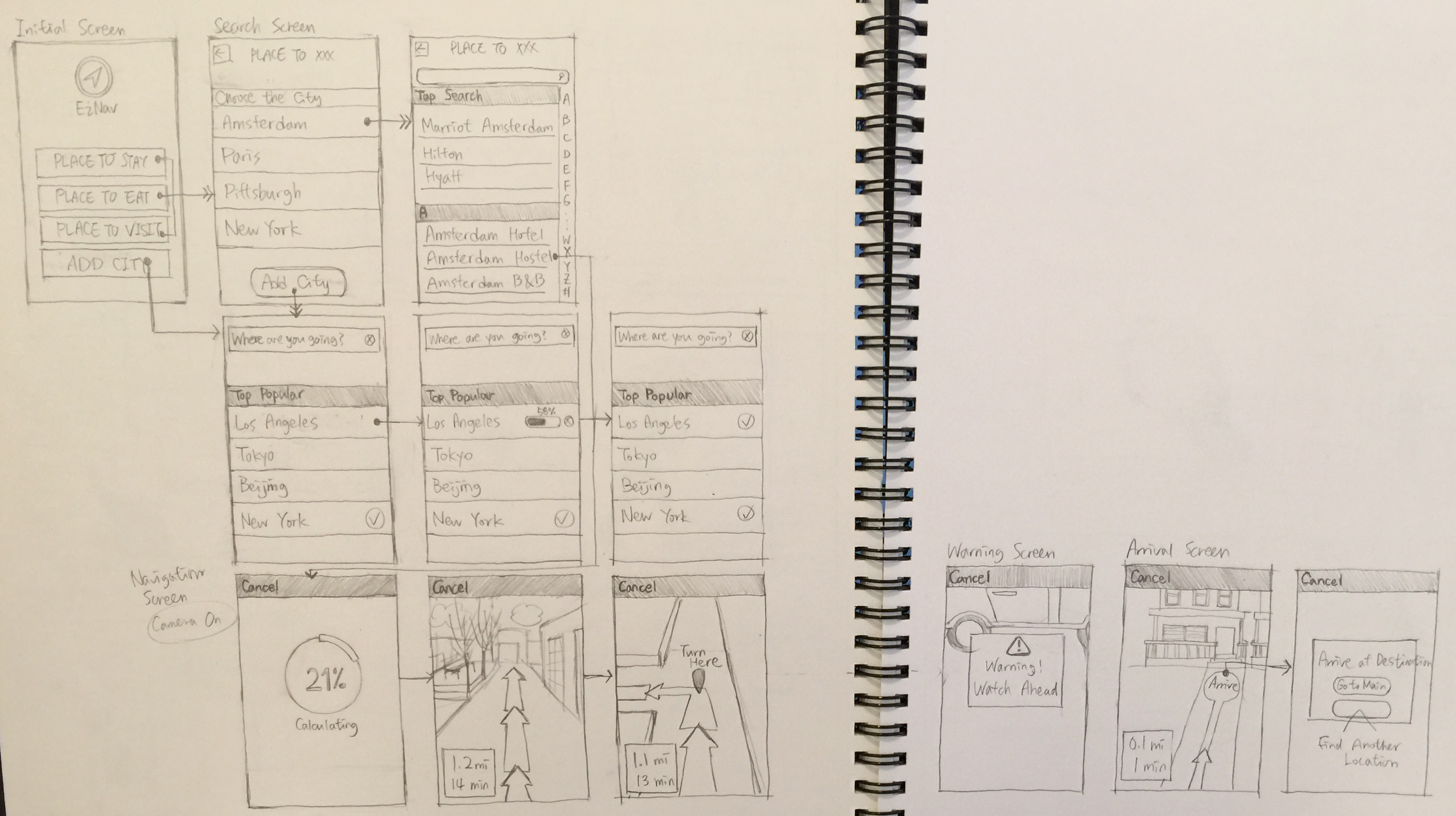
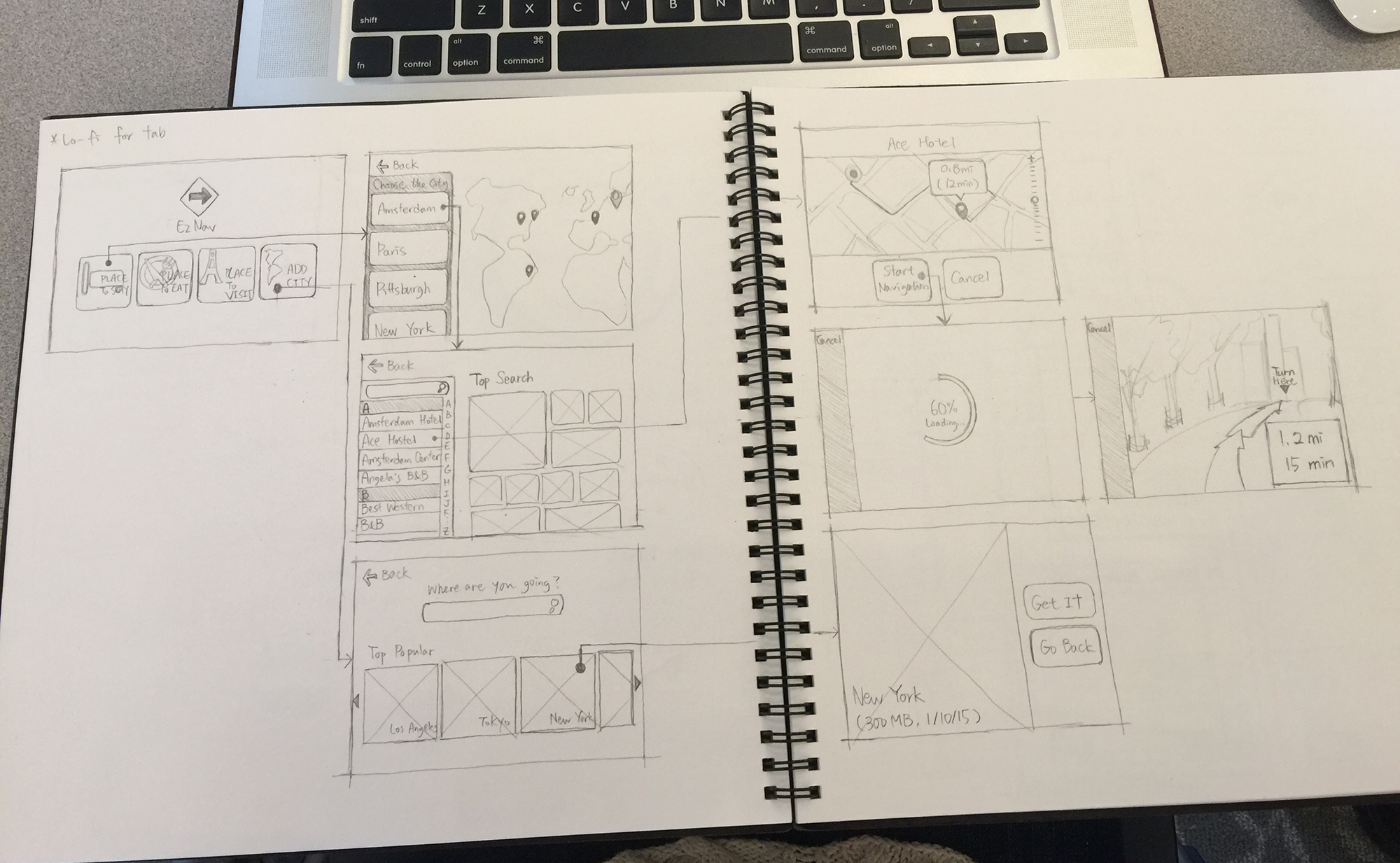
After multiple iterations, I designed hi-fi UI elements for phones, tabs and kiosks. To show the different user experience, I designed UI for kiosks differently from other personal devices.
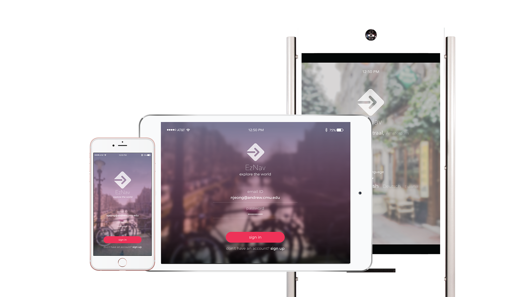
Final design of hi-fi landing pages
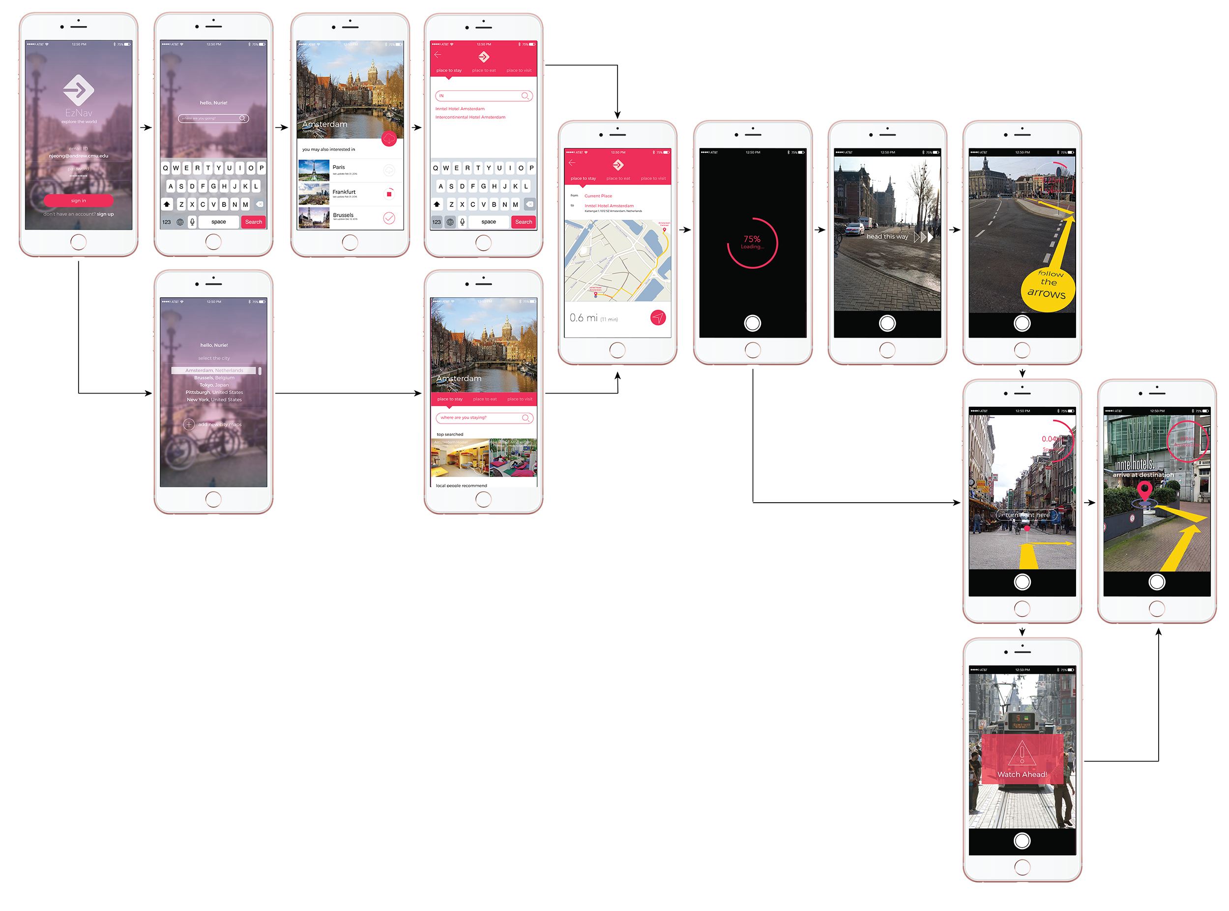
Screen & Flow Design
Finally, I designed the UI flows of each device and the rest of screens. Then I made a video prototype of the each UI (See top)
What's Beyond: for Smart Glasses
My final work was to designing a UI for future devices. I imagined a full bleed augmented reality UI for smart glasses and lenses. On top of that, I added the communication components between local business owners and travelers; When travelers request their business owner about the direction, they draw a draft map on their device and send it instantly over visitors' account. Then the travelers see the direction through the lenses. Even if they get lost in the middle, they contact the owner by phone or text and get a new direction.


Augmented Reality UI for Smart Glasses/Lenses